SUSSMAN DESIGNS


My Role: UX Designer/Researcher | Team: 3 UX Designers
Tools: Sketch, Miro, InVision | Time: 3 Weeks
Project Overview
As a team we conducted research, gathered insights and designed HUB, the newest streaming service, bringing all your content together in one place. Roku, a respected name and leading platform in home streaming, proved to be the most ideal brand to partner with for this companion. We found Roku to be valuable because they are a trusted brand that aren’t already a part of a greater service provider like Amazon, Apple, or Google and they don’t have any presence on computers a growing platform for cable cutters for consuming media.
Goals / KPIs
Analyzing the behavior of users and tracking their trends to better understand "success" through screener surveys and interviews to determine:
- Percentage of users who consume content through recommendations
- Average time spent watching vs browsing
- Use "TensorFlow" to build a recommendation engine

Problem
“ How might we enable users to discover quality content across either streaming or cable accounts and devices?”

Discover Page (Home): hover over shows source and additional information, options for Live TV, and recommendations

Opportunity / Discovery
While users were able to complete tasks with relative ease most of the advice we received was based less on their performance and more on how they felt as they went through the prototype.
-
Users were overwhelmed by amount of content
-
Users had difficulty finding the ‘Manage Accounts’ Page
-
Value added by the recommendations wasn’t apparent to the users
-
Users felt it was too “Netflix”
Solution
Because some users didn’t see the value added by the recommendations: added a call to action for recommendations in the form of a short quiz in lieu of not being able to implement APIs to gather an algorithm at this stage.

Successes
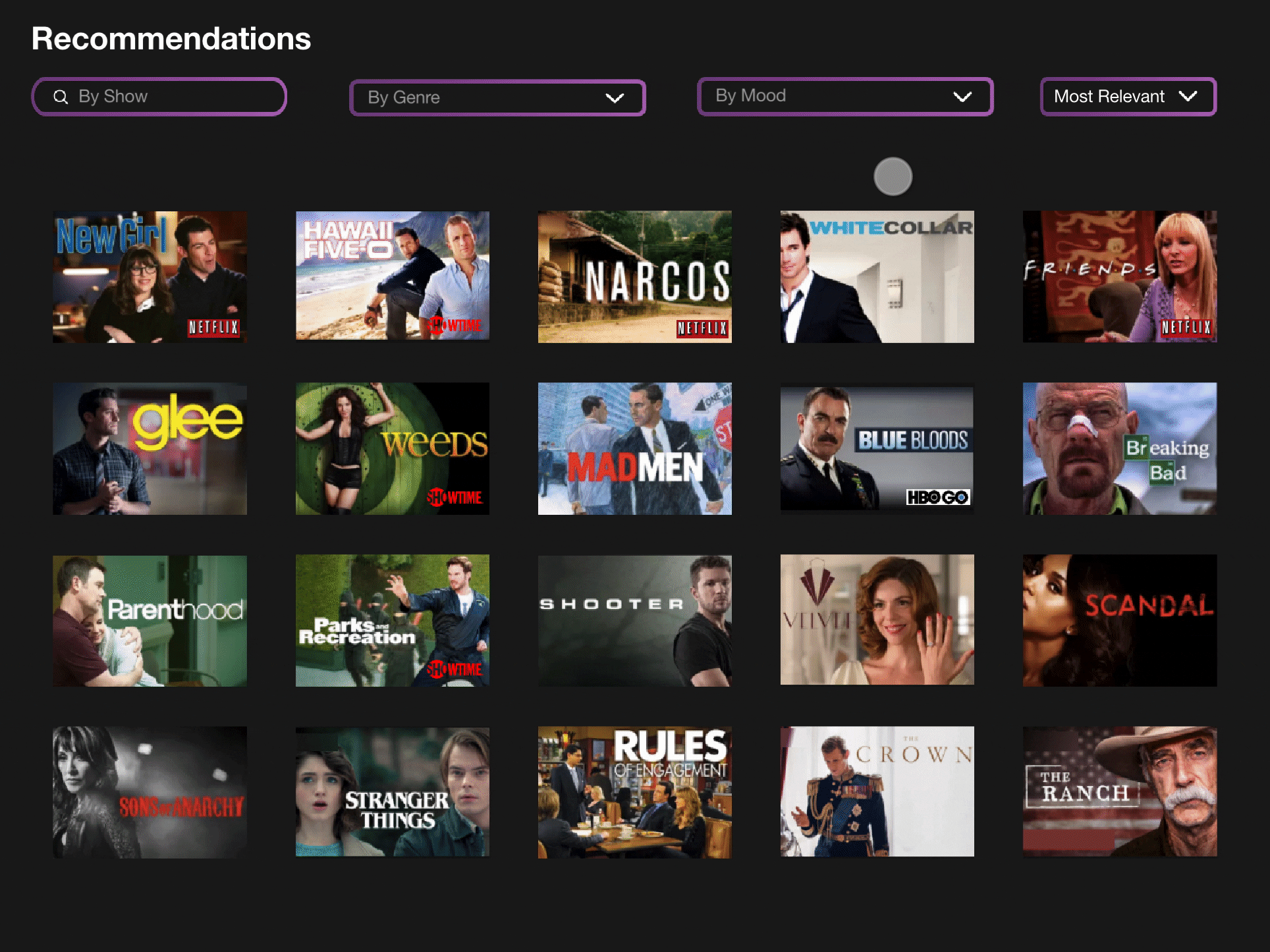
We would begin a brief A/B Testing exercise to determine between the "Hero Image" and "Recommendations" feature. We found users liked both about equally and voiced that they’d prefer both ideally. So we ended up putting them together (this also helped fill out the navigation page with more content). We also added a mood feature to the filter recommendations since users liked them from the quiz.

Reflection
-
Continue A/B Testing with both recommendation features
-
Card Sorting to improve recommendation quiz categories
-
Begin discussing designs/features with development and stakeholders
-
Continue working to address secondary persona's needs
Moving forward we would like to test the final site more so we can get more comprehensive data from the first two tasks and more importantly see how users react to both recommendation features together. We aren’t entirely sure how successful we were in making HUB feel like it’s own thing and less like Netflix. Perhaps having users test Netflix’s site would have helped us determine how to improve or differentiate.
It seems like users were all very interested and excited about the prospects of what we’d created. If we could figure out how to get streaming services to agree on mixing content with other streaming services in a central location that would be the final step as well as making sure our designs work to benefit of all the necessary business and development teams we would be in communication with.